Trust
We build dependable rails that fintech teams can rely on. Our brand reflects reliability, security, and transparency.
Everything you need to represent unitpe accurately and consistently across all touchpoints. These guidelines ensure our brand remains cohesive, professional, and recognizable.
Brand Values
Our brand identity is built on four core values that guide how we communicate, design, and interact with our community.
We build dependable rails that fintech teams can rely on. Our brand reflects reliability, security, and transparency.
We move fast with discipline, shipping products that solve real problems. Our brand is modern, forward-thinking, and solution-oriented.
We believe in clear communication and straightforward solutions. Our brand is clean, uncluttered, and easy to understand.
We work alongside our merchants and partners, not just for them. Our brand is approachable, collaborative, and supportive.
Logo Usage
Our logo is the cornerstone of our visual identity. Follow these guidelines to ensure consistent and professional representation.
Light Background

Dark Background
Guidelines
Follow these visual guidelines to ensure proper logo usage across all applications.
Maintain a minimum clear space of 20% of the logo height on all sides. Never place the logo smaller than 24px in digital formats.
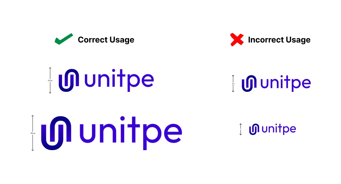
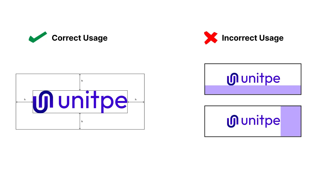
Always maintain adequate spacing around the logo. The clear space should be at least equal to the height of the 'u' in unitpe.
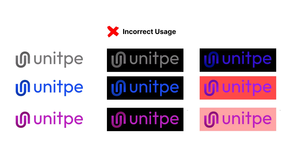
Use the full-color logo on light backgrounds. Use the white/light version on dark backgrounds. Never use colors that clash with the logo.
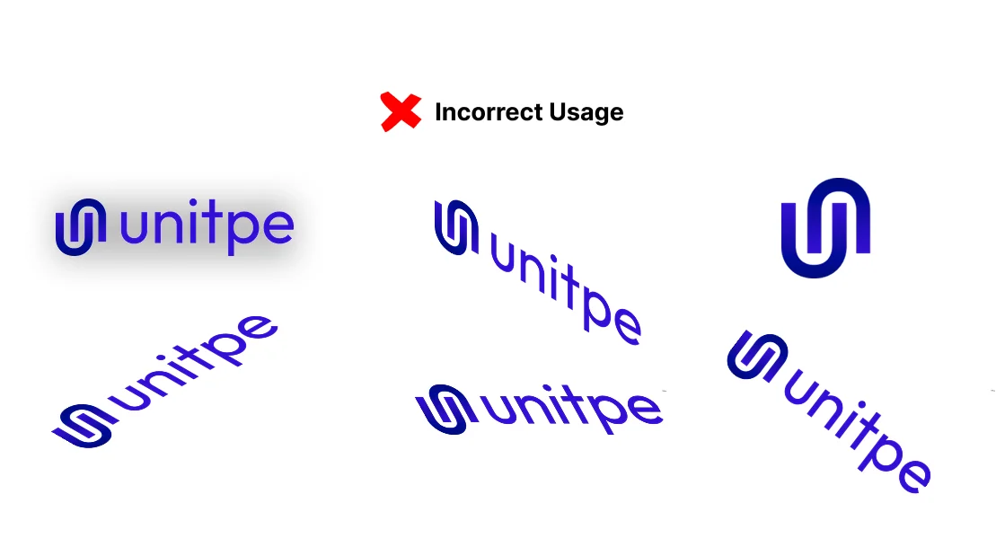
Never stretch, skew, rotate, or add effects to the logo. Always use the provided logo files without modifications.
* Failure to abide by these brand guidelines may result in legal action.
Colors
Our color palette is designed for accessibility, consistency, and brand recognition across all platforms and media.
#3800d4
oklch(0.4152 0.2603 275.3)
Primary brand color, used for CTAs, links, and key UI elements
#02007d
oklch(0.2674 0.1841 264.69)
Secondary brand color, used for backgrounds, subtle UI elements, and secondary content
#ff8a5f
oklch(0.7538 0.153472 40.5544)
Accent color is used to highlight important UI elements
Typography
Typography plays a crucial role in our brand communication. Use these fonts consistently to maintain our visual identity.
Outfit
Weights: 400, 500, 600, 700
All headings (H1-H6), display text, and emphasis
Outfit
Weights: 400, 500
Body text, paragraphs, and general content
Fira Mono
Weights: 400, 500
Code snippets, technical documentation, and monospace content
Heading Examples
Body Text
This is body text. It should be readable, clear, and comfortable to read at any size. We use Outfit for all body content to ensure consistency across our platform.
This is smaller body text, typically used for captions, metadata, or secondary information.
Code / Monospace
const apiKey = "your-api-key";Voice & Tone
Our voice and tone guide how we write and speak. Consistency in communication builds trust and clarity.
We speak with authority but remain accessible. Avoid jargon when possible, and explain technical concepts clearly.
Get to the point. Our audience values clarity and efficiency. Avoid fluff and marketing speak.
We're proud of what we build, but we acknowledge that payments are complex. We don't overpromise.
Always lead with the problem we solve and the value we provide. Show, don't just tell.
Best Practices
Quick reference guide for using our brand assets correctly.
Assets
Need our logo or other brand assets? Contact us for access to our complete brand asset library.
For brand assets, logo files, and usage permissions, please reach out to our team. We'll provide you with:
Questions?
If you have questions about using our brand assets or need clarification on these guidelines, we're here to help.